All images via Under Armour’s official Twitter account (“@UAFootball”)
Today was the day! If you asked, “What day!?” Just hop on twitter and scroll through your timeline and I’m sure you’ll figure it out soon enough. Today was the day that *drum roll, glitter cannons* Notre Dame unveiled this year’s Shamrock Series uniforms! Like anything involving Notre Dame and fashion, I was all over it.
I love guessing what the uniforms will look like from year to year and I’ll admit I had some pretty grandiose off the wall ideas for this year’s uniforms. Black and metallic gold! Glow in the dark! LIGHT UP CLEATS! (Would that even be legal? Yeah, probably not). Turns out however, they aren’t quite as alternative as I was imagining (deep breaths, gold seaters!)
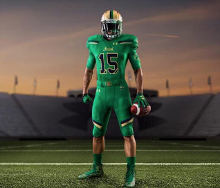
The overall design can best be described as well, green. I guess the head to toe green look is pretty darn fitting seeing as the Irish will take on Boston College in this year’s Shamrock Series game at Fenway Park. Get it? Fenway Park? Green monster? Green uniforms!? Oh, Under Armour you’re clever.
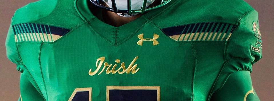
 While green is definitely the overwhelming majority of this look, stripes are a close second. There are stripes on the shoulders, stripes above the knees, stripes down the sides of the pants, stripes down the middle of the helmet, and stripes on the gloves. Oh, wait! I found more; Stripes in the bottom corners of the numbers. In the words of Oprah…You get a stripe! And you get a stripe! EVERYONE GETS A STRIPE! But wait, there’s more!
Not only does this uniform have a lot of stripes, it’s actually like some sort of stripe inception if you look closely. Many of the stripes, the ones on the back of the helmet for example, are divided or slashed further into 11 separate stripes. 11? What’s significant about 11? (Please tell me you know this…) 11 is the number of national championships boasted by the Irish. Now, don’t get me wrong! That’s a pretty cool nod to Notre Dame’s achievements and I’m usually super into that hidden gem sort of stuff. I just think this uniform chose to drive that point home a little too much. If it were just represented in the stripes on the back of the helmet or the stripes at the shoulders, I would have been totally on board. That’s really a minor complaint, however. Overall I like this look. (I did have a thing for the green Power Ranger as a child, though so perhaps I’m a bit biased)
The helmet, which is a gold base featuring a metallic gold leprechaun face, is absolutely on point. Be sure to take a closer look at the facemask, too. I missed it the first time, but after some staring and head tilting it hit me; they’re not navy, they’re not green…they’re both! The dual colored split facemask isn’t something I love or hate, but it is something I will give props to UA for incorporating. That’s bold my friend.
What’s also bold is that we have some logo mixing. The base layers feature shamrocks on the arms, the center of the jersey has a script “Irish”, and the pants feature a full body leprechaun. Throw in the profile of the leprechaun on the helmet and well, gang’s all here! I like that, though. This uniform does have a lot going on, but I feel like you have to do a lot of looking to find it. In other words, it doesn’t all hit you over the head and clash all at once. At least, I don’t think so.
Basically, we have a green uniform, a really green uniform, accented with some navy and gold stripes and enhanced with a nod to Irish tradition and history. I think this uniform will do a good job of pleasing almost everyone (I mean, we’ve come a looonnnggg 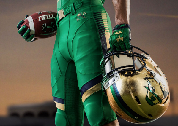 way since 2012) and, although not as cool as the all white uniform (cue swooning) I’m really digging the monochromatic look.
I’d give them a solid 8/10. I would have given out another point or two if the stripes had been used more conservatively. Sometimes less is indeed more…except when it comes to championships. Here’s hoping they will have to cut another slash into those stripes next year! What are your overall thoughts? What does your dream alternate uniform look like? Chime in below!
A former HLS contributor and HLS TV co-host, Molly now runs See Molly Blog, a site combining her love of writing, fashion, and lifestyle experiences that she describes as "ultimately be unapologetically me."
- Notre Dame Throwbacks: A Fashion Review - August 13, 2019
- Fashion Review: The Shirt 2016 - April 18, 2016
- HLS TV (Episode 20): Goodbye to Undefeated Records & Tex - October 8, 2015
I like it. Maybe could have done away with the stripes above the knee pads. Overall great look. Is it too early to predict next years iteration of the uniform. I would love to see a all metallic gold, top to bottom with a blue and green accent.
I love it and most of all, I’m sure the kids do too,,,,,,,,,,,,,,,, and I’m 56.
Hideous
If the pants were gold or something. The Uni-tone look is just bad.
About the only thing I’m not pleased with is the leprechaun head on the helmet. Would rather they have used the classic boxing leprechaun logo. And it’s good they finally have the shade of green heading away from forest and back in the general direction of the classic Irish Kelly green.
I too am glad about the green tone and hope they stay on this course for many years to come. I think the leprechaun head is a direct translation of the current logo — unless you mean the original Drake logo that’s smoking a cigarette? (Just my opinion, but I’m cool with relegating that to the archives)
Haha, no I’m not saying to go back to the leprechaun logo they used from my dad’s time at ND. I grew up with this being the only version: https://localtvwdaf.files.wordpress.com/2011/10/notredamelogo.jpg?w=400, so that’s the one I was referring to. The one they decided to use looks to me more like an Irish version of Popeye. I’m a fan of both of those things, just as long as they’re not cobbled together.