Happy 27th The Shirt-iversary! (That’s totally a thing!) This past weekend was the annual Blue-Gold spring game where the Notre Dame Fighting Irish football team gave us a taste of what’s in store for us on the field this upcoming season (well, you know sort of…kudos to you if you understand the scoring!)
Likewise the bookstore unveiled what’s always a much anticipated – probably the most anticipated – clothing item of the year: The Shirt. I’ve reviewed The Shirt the past 2 years and I figured, why not emerge from my ND blogging void to bring you my reaction to this year’s design? After all, some things never change and this girl can’t say no to anything that combines Notre Dame football and fashion. Of course, I’d love to know what you think as well, so be sure to leave your comments and opinions below!
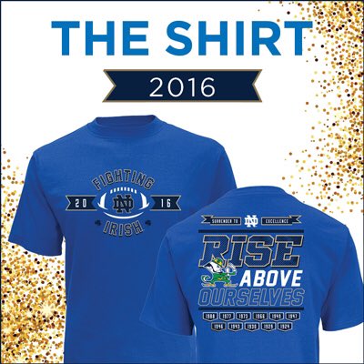
Welp, there you have it folks! The 2016 version of The Shirt (I apologize that blogging doesn’t lend itself to super exciting reveals, although I’m not sure anything could compare to BK peeling off his top layer, holding his arms up in the air TD Jesus style, and rocking this tee tucked into a pair of pants…bold move, Mr. Kelly)
I’m going to break down The Shirt as I have in the past, considering the following elements; color, the front design, the back design, and my overall thoughts. So, here it goes! The fashion police are officially on patrol.
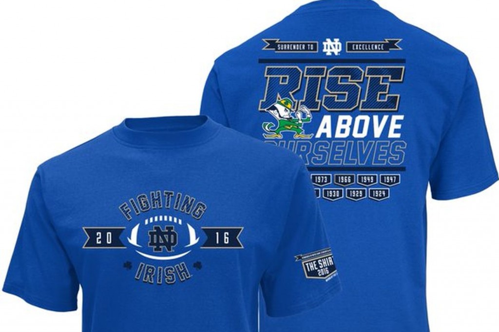
Color: Let me first address the (multicolored) elephant in the room. The color is still not uniform, and not only is it not uniform, it’s still not always an official school color…unless, the Irish have adopted this bubble gum as of late and didn’t tell anyone.
Honestly, this color isn’t shocking in that it’s new, because it’s actually very similar to the blue of the 2011 The Shirt (I’ll give you a second to dig it out of the depths of your dresser drawers if you don’t believe me..told you!) What is shocking, however, is that they used it again. It’s a nice color – don’t get me wrong. But what’s wrong with green or navy or gosh I don’t know…classic white? Even if green and white aren’t technically official team colors, I think they would serve a much better canvas than this radical blue. I’m interested to see how it sells, because year after year the fan base expresses their desire for consistency as far as the color of The Shirt is concerned, and year after year we have to wonder if it’s going to be flesh-toned gold or kelly green (I’d vote for the second one every. single. time)
Design, Front: Ummm, there’s a football, and the date, and the name of the team. Yeah, that about covers it. Something about the front of this year’s The Shirt makes me have major deja vu. Like, haven’t we seen this design before? The front definitely seems as though it was a design pulled from the stock photo archives. According to the description on theshirt.nd.edu the front design is evidently a nod to the 1991 shirt, “which featured ‘Irish’ with a football graphic.” Something tells me 25 years later, we could have gotten a bit more creative. But, if the front is this plain, certainly the back will have a certain level of interest and intricacy to balance it out…
Design, Back: …or not. The back is equally as plain, or minimalistic, as the front. I will say that the two quotes, “Surrender to Excellence” and “Rise Above Ourselves” are pretty dang awesome and inspiring. Both quotes are from a longer block quote from the late, great Fr. Ted who said, “There is no academic virtue in playing mediocre football and no academic vice in winning a game that by all odds one should lose. … There has been a surrender at Notre Dame, but it is a surrender to excellence on all fronts, and in this we hope to rise above ourselves with the help of God.” *cue chills* I absolutely love that! I don’t however love how it was just sort of placed on the back. The back also features “banners” emblazoned with the years the Irish took home a National Championship. I look forward to the year they have to mess around with the spacing to add another banner! All in good time…
Overall Thoughts: Okay, so I’m sure if you’ve read my thoughts on each individual category you can already sort of take a stab at where I stand on this year’s design.
I’m not a huge fan.
*Cue gasps, and clutching of pearls*
This year is my first slightly negative review, but I’m just not wowed. I will say that it’s a nice, simple tee that really hits all the traditional, expected design points, but that’s not really what I expect from The Shirt. I sort of miss the images of specific players chest bumping each other after a huge TD, and the more traditional colors (I am my father’s daughter, huh?!). I mean, it is 100% cotton and available in a women’s cut this year which is nice (goodbye boxy shoulders), but I’m just not feeling it. Give me kelly green and a picture of The Rocket circa 1989 returning a kickoff against Michigan and a bit more of an avant garde design and I’d be a happy camper. I just can’t get excited about our student section wearing these. But hey, a winning record always has a way of making things like a sub par The Shirt design seem like a very minor detail in the grand scheme of things.
A former HLS contributor and HLS TV co-host, Molly now runs See Molly Blog, a site combining her love of writing, fashion, and lifestyle experiences that she describes as "ultimately be unapologetically me."
- Notre Dame Throwbacks: A Fashion Review - August 13, 2019
- Fashion Review: The Shirt 2016 - April 18, 2016
- HLS TV (Episode 20): Goodbye to Undefeated Records & Tex - October 8, 2015
As I said to Anastasia, this design is garbage and I encourage everyone to make this the Official Unofficial Shirt for 2016. http://www.bkstr.com/ProductDisplay?urlRequestType=Base&catalogId=10001&categoryId=10040&productId=75400319&errorViewName=ProductDisplayErrorView&langId=-1&top_category=&parent_category_rn=&storeId=10900
I didn’t even know that shirt existed until now, but I NEED it!
RIGHT?
I can get over the color… yawn to a Duke blue again but so what. Thank goodness it’s not some ridiculous yellow-ish poop color. What kills me are the 25 different fonts on the back. It’s as if someone got into Photoshop for the first time and went wild with the effects. I like the concept but it could have been cleaner. 2 out of 5 stars for me.