So, it’s no secret that I like fashion and it’s certainly no secret that I like Notre Dame football. Okay, Okay! I love fashion and I love Notre Dame football. That being said, the unveiling of “The Shirt” is naturally an exciting day for me each year because much like the unveiling of the Shamrock Series uniforms, it’s an event that combines two of my favorite things. Of course, I’m not the only one who looks forward to this tradition. 2015 marks the 26th year for “The Shirt” project and while its April 26th reveal was perhaps a bit less hyped without a public Blue and Gold game to usher it in, Twitter was certainly buzzing with anticipation, excitement, and of course opinions. While I can’t speak for the entire fan base, I can offer the humble opinions of a self-proclaimed fashionista.
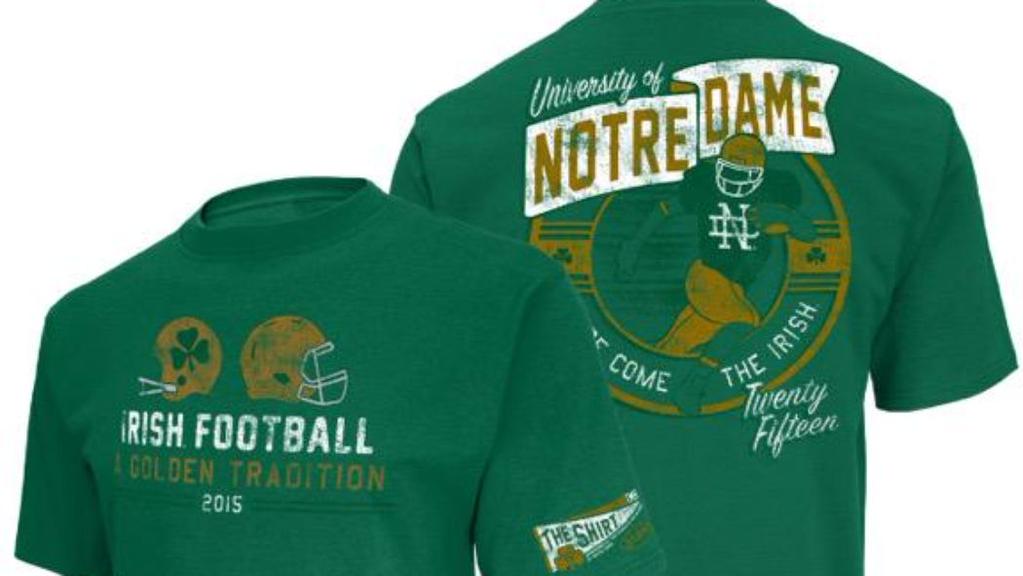
Image via @theshirtND
Color: The color is without a doubt the most talked about element of “The Shirt” each year. This year’s choice is a lot easier to describe than last year’s bluish-grayish one. Green. Yeah, that about sums it up. If you’re keeping score, that brings it to an even 3 blue shirts and 3 green shirts for the 6 years that Brian Kelly has been head coach. Any early bets for next year?
Design, Front: The front of the “The Shirt” features the profile of two helmets above the simple text: “Irish Football/A Golden Tradition”. In re-reading my review of last year’s shirt, I noticed that I commended the simplicity because an age-old rule is fashion is “less is more”. If I thought last year’s shirt followed that rule then this year’s wrote it. I love the understated look of this year’s design. It’s not trying too hard, and really it doesn’t have to. Notre Dame football fans are notorious for their fierce loyalty not only to the game, but also to the storied traditions that make the football program something that spans beyond the gridiron. The phrase “A Golden Tradition” sums up these loyalties while the helmets, one modern and one an homage to the past, represent their immortality.
Design, Back: The design on the back of “The Shirt” is equally simplistic. Name of the university? Check. Image of a football player? Check. Recognizable phrase? Check. Honestly, it doesn’t get any simpler, and that’s a not a bad thing. Actually, I think it’s a very good thing. Of course, the beauty of simplicity is that it can often be strategically representative of something more complex. The official description of this year’s design explains that the pose of the player on the back is a nod to Notre Dame’s 7 Heisman trophy winners while his garb is a nod to the modern era and the future of the program. And you thought it was just a faceless drawing of a random player. HA!
Overall thoughts: I think this year’s design for “The Shirt” is a definite home run…touch down? Either way, I dig it. It’s simple with a bit of a vintage, worn look. The past couple of years have had designs that incorporated images of the stadium or the likeness of specific players, all of which were sort of obvious regarding the point they were trying to make. I like that this shirt is understated while still being representative of Notre Dame’s past, present, future, and ongoing traditions. I’ll definitely be rocking one on Saturdays this fall, how about you?
A former HLS contributor and HLS TV co-host, Molly now runs See Molly Blog, a site combining her love of writing, fashion, and lifestyle experiences that she describes as "ultimately be unapologetically me."
- Notre Dame Throwbacks: A Fashion Review - August 13, 2019
- Fashion Review: The Shirt 2016 - April 18, 2016
- HLS TV (Episode 20): Goodbye to Undefeated Records & Tex - October 8, 2015
I definitely like it. I just wish we didn’t do the alternating color gimmick every year. Still drives me up the wall.
I am glad the alternated to green and hope they never alternate again.
Oh, but you know they will. If there was a place to bet that next year’s shirt would be some shade of blue, I would throw all the money at it.
Not sure that I buy the Heisman reference on the back (arm is positioned incorrectly), but pretty decent overall. I like the pennant on the sleeve; nice touch.
Hi Dave: thanks for reading and writing. The Heisman-reference on the back is actually pretty spot on if you recall, as any real fan would, the official photo of John Lattner or the version of that done in what was perhaps giclee, or maybe even crayons, for the cover of the program for the 1993 Florida State game. The similarities between the two are legion, making Molly’s reference as correct as your use of a semi-colon.
(psst, Bayou, Molly noted that the Heisman nod was in the official description of the shirt: http://theshirt.nd.edu/ )
I am wondering who that image is supposed to portray, as we have never (to my knowledge) have had a green-skinned player on the roster.
On another note: can we make sure our shamrock series uniforms are just a giant monogram as pictured on the rear of the shirt?
I feel like there’s a potential fullback joke here.
psst, Tex, I once put Clemson in the SEC. You think I read official descriptors or articles themselves?
In your defense, there are multiple Tigers in the SEC