This morning, The Observer reported on The Shirt’s unveiling, and the article contained a quote from Kristin Andrejko, The Shirt committee’s vice president. According to the article, she said, “I think it’s special because I’ve never seen a Shirt that captures a moment in the stadium, and I think this Shirt really does just that. It’s the players walking out at the beginning of the game, holding hands, a sign of unity … and it’s the chills you get when you hear ‘There’s a magic in the sound of their name.'”
According to The Shirt (committee’s) own timeline, though, not only is this not the first The Shirt to “capture a moment in the stadium,” this year’s The Shirt is actually a pretty blatantly repackaged The Shirt from 2003. Here they are, 2017 and 2003, for your comparison:

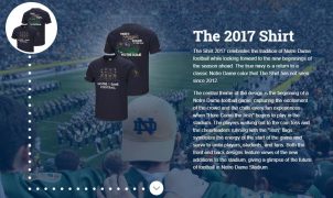
So there it is: 2003 has the shamrock, the players walking with hands joined, the word “magic” in a special font, and the same slogan. The only big difference is the color. I guess we’ve run out of ideas up at The Shirt central.
As far as this year’s offering being the first to “capture a moment in the stadium,” and setting aside that this year’s The Shirt is an almost-exact replica of 2003’s, again, the timeline shows us that that’s not true either. 1993’s The Shirt (“Onward to Victory”) has the “raising of the helmets” moment. 1998’s The Shirt (“Here Come the Irish”) has the “players running out of the tunnel” moment. It also features the players’ jersey numbers as 1, 9, and 98, so we know that not even that element is unique to this year’s The Shirt. 1999’s The Shirt (“Love Thee Notre Dame”) has, again, the “raising of the helmet” moment.
Maybe 2003’s appearance explains why Coach Kelly proclaimed this year’s (2017) his favorite. That was his last year at Grand Valley State.
Anyway, maybe I’m making too much of The Shirt. But since the University is, too, they should do better than repackage old designs and pass them off as new.
Author’s note: I have no firsthand memory of The Shirt in 2003. I was deployed that year.

Hating Hurricanes Since 1990.
Bayou Irish is a Jersey boy and Double Domer who fell under New Orleans' spell in 1995. He's been through Katrina and fourteen years in the Coast Guard, so we cut him some slack, mostly in the form of HLS-subsidized sazeracs. But, when he's not face down on the bar and communing with the ghosts of Faulkner and Capote at the Carousel Bar in the Hotel Monteleone, he's our man in SEC-land, doing his best to convince everyone around him that Graduation Success Rate is a better indicator of success than the number of MNC's won in the last five years.
- Finding Flaws in a Diamond: Clemson’s Rushing Offense - December 17, 2018
- Why Nobody Will Cotton to Notre Dame - December 3, 2018
- Irish Finish Regular Season Perfect 12-0 - November 26, 2018

2003 was my first Shirt as that was my freshman year. As soon as I saw the 2017 design, I immediately went back to memories of Ty’s “sea of green” shirts.
I don’t particularly care about repeating designs. After all, there’s only so many slogans and quotes that we can dig up without getting too obscure, or using a terrible quote (see: pee-yellow shirt with Theisman quote). I’m all for simple: ND Football , random picture, and, most importantly JUST STICKING TO GREEN FOR CRYING OUT LOUD.
2003’s was green and then they’d have been copying that, too. God. I think repeating designs is a big deal, since they didn’t (apparently) do it deliberately. When someone says, “this is the first time…” or “this is unique…” they shouldn’t do so against the backdrop of a rehash. I’d love it if they went with a “this is our shirt forever” design, but they’ve got tons of creative people on campus and they can come up with a new design every year. As long as it’s green.
“Anyway, maybe I’m making too much of The Shirt.”
Yes. Yes, you are.
I don’t disagree, but then I come back to the fact that The Shirt gets an annual unveiling and a ton of hype and we’re expected to wear it.
I see the pre-reveal hype as a means to drive sales and has almost no impact on the in-stadium appeal of The Shirt. I would separate the two aspects of it. I concur with green, though.