
Via UND.com
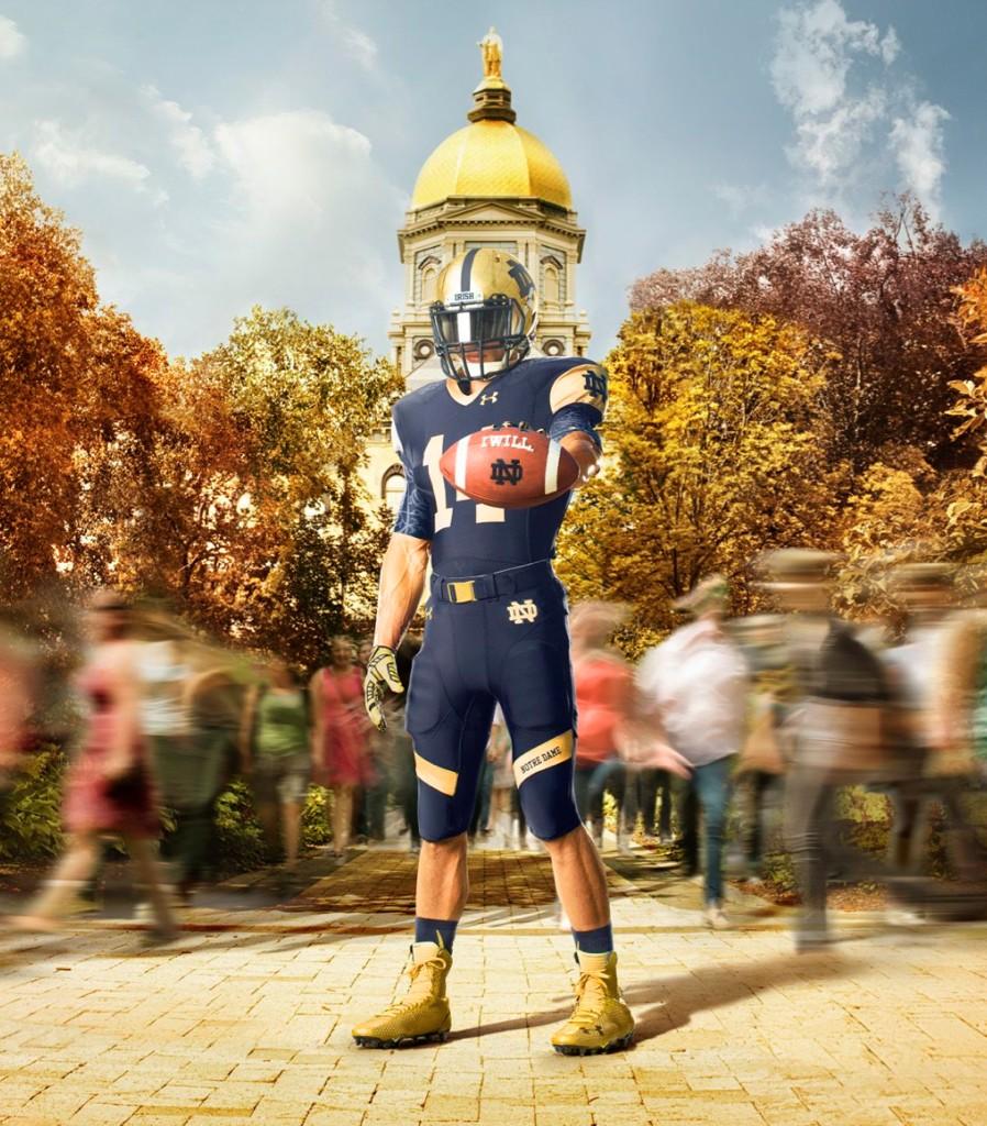
Well, it’s that time of year. Media day, otherwise known as #Swatchmas aka “The Day We See the Shamrock Series Jerseys”, has arrived. I must say that, once again, I am very pleasantly surprised with the look.
Let’s start the uniform review with what usually is the most controversial element every year: the helmet.
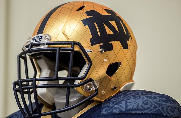
Via Matt Cashore (@mattcashore)
This year, a lot was done to the helmet, but I must say it is an incredible look. The inspiration for the entire uniform came from the unique architecture on campus. As the golden helmets have always been a nod to the Golden Dome, these helmets take it a step further by adding in the familiar pattern of the Dome on the helmet. As the Shamrock Series helmets have often done, additional elements were added to the helmet in the form of a navy blue ND monogram and stripe.
Personally, I think it works. If you just have the Dome texture lines on the helmet, I think it would look off, especially in contrast to the rest of the uniform which is dominated by the navy blue. It’s simple, doesn’t go overboard, and it matches the facemask perfectly as well.
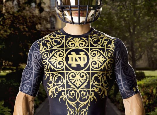
Speaking of the rest of the uniform, the attention to detail on the jersey itself is incredible:
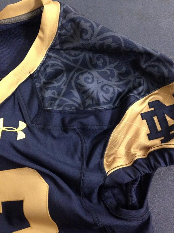
Via Ryan Grooms (@NDFBEquipment)
Again, the Dome pattern appears on the gold elements, but on the jersey we see design elements that you would find on inside the Main Building. Yes, it’s a nod to ND’s buildings, not some Affliction knockoff.
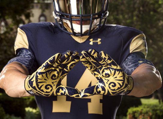
The same mosaic pattern appears on both the gloves and the undershirt:
Via UND.com
Via UND.com
If there is one element I’m not too high on, it’s the undershirt (or “base layer” as you may see it called). That’s a bit too much for my personal tastes, but I’m not going to be seeing it on the field anyways, so I really don’t care.
Another unique touch on the uniform comes at the bottom of the jersey:

Via UND.com
The “God, Country, Notre Dame” slogan is a new touch now featured on all ND Under Armour Jerseys, including the traditional home and away jerseys. It’s a great nod to ND’s tradition and I think it’s a great way to differentiate, from a marketing standpoint, the old Adidas jerseys with the new Under Armour ones (besides the logo).
The only other elements left to discuss are the pants and the cleats. For the second year in a row, Notre Dame has one color dominating the majority of the uniform (last year’s was nearly all-white). The gold diagonal stripe on the pants breaks that up fairly well as do the gold cleats. In fact, when looked at as a whole, the uniform really looks quite well thought-out at each gold element seems to be in a perfect spot to not create a look that has too much blue.
Overall, A+ work from Under Armour in their first crack at the Shamrock Series jerseys. Personally, I think they get better every year and I love how the Dome/Main Building served as the inspiration for this year’s look.
The only downside? These jersey are absolutely wasted on Purduzzzzzzzzzzzzzzzzzzzzzz……………
Texan by birth, Irish by choice.
First-generation Domer and a former student manager, HLS podcast host, HLS Sim creator, Extra Life streamer, and technical problem haver. You can find more non-Notre Dame related writing on his Patreon.
- Epilogue - January 3, 2022
- HLS Podcast Finale - January 2, 2022
- The Final Fiesta: Notre Dame vs Oklahoma State NCAA ’14 Sim - December 31, 2021