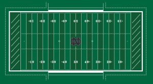
Today, Notre Dame announced details on the FieldTurf that will be installed in the House that Rock Built. One of the biggest questions, whether or not the design of the field would see changes with the new surface has been answered. That answer is yes with the most notable change coming in the form of a midfield interlocking ND monogram logo and a lesser (and surprise, in my opinion) change to add shamrocks at the 35-yard line to mark kickoff locations:
“The interlocking ND is the most recognized symbol of our University and its athletics programs, and we wanted to communicate that to our fans and all those viewing our home games on NBC,” said Notre Dame vice president and athletics director Jack Swarbrick.
“The integration of the shamrocks allows us to achieve consistency across all of our new or recently renovated facilities where both the interlocking ND and a shamrock have a presence on the playing surface.”
Endzone logos, however, are out. Notre Dame will stick with the familiar diagonal lines in both endzones. There will be 18 total lines, 9 in each endzone, pointed towards the Dome and Basilica at a uniform 42 degree angle. Those numbers are not a coincidence, but a nod to Notre Dame history as the numbers represent the year 1842, the founding year of Notre Dame.
In the end, it’s a mix of something old and something new. Notre Dame has been toeing a delicate line between preserving older traditions while trying to create something new, giving future and current students and student-athletes something to call their own.
This change sound give everyone something to love; however, I’m sure the change will also give something for many to hate. Personally, I would’ve preferred that ND keep the new turf a carbon-copy of the the grass field that we have grown accustomed to. That being said, I’m not going to be upset with the new additions, even though it will take some getting used to.
The way I see it, the endzone diagonal lines in Notre Dame Stadium have become iconic, even though ND has had various endzone designs in the past (especially during the Dan Devin era). The lack of additional designs at midfield and the kickoff markers don’t really fall into that category. I’ve always had issues with the logic that the lack of something equates to a tradition that requires it to remain that way.
I’m happy Jack Swarbrick and company are able to recognize what is an isn’t important in such design decisions. I think this is the best that they could have possibly done to please both the hardcore traditionalist and the fans that want as much change as possible.
You can’t please everyone, however, the process and care involved in even the most minor decisions (and make no mistake, a midfield logo is incredibly minor) should make everyone happy.
- Epilogue - January 3, 2022
- HLS Podcast Finale - January 2, 2022
- The Final Fiesta: Notre Dame vs Oklahoma State NCAA ’14 Sim - December 31, 2021


I was hoping for a bigger logo…not A&M Commerce big, but bigger than this rendering appears
MAKE THE LOGO BIGGER