
Back in May, Brian Kelly had the following to say about this year’s Shamrock Series uniforms:
And just to put some clarity to the Shamrock Series…it’s my chance to listen to everybody talk about our crazy uniforms. I love it.
And we got some uniforms this year. If you didn’t like the shamrock, and the blue shamrock, if you didn’t like that one, you’re going to hate this year’s. It’s gonna be awesome. So I’m just getting you ready for it.
This morning, Adidas and Notre Dame unveiled the new look:
http://youtu.be/1W09j2RcBkQ
I must say…I think Kelly lied to me because I actually like these.
And no, I’m not talking about marginally liking parts of the uniform and hating other parts with a passion like last year. I truthfully, honestly, think these look great.
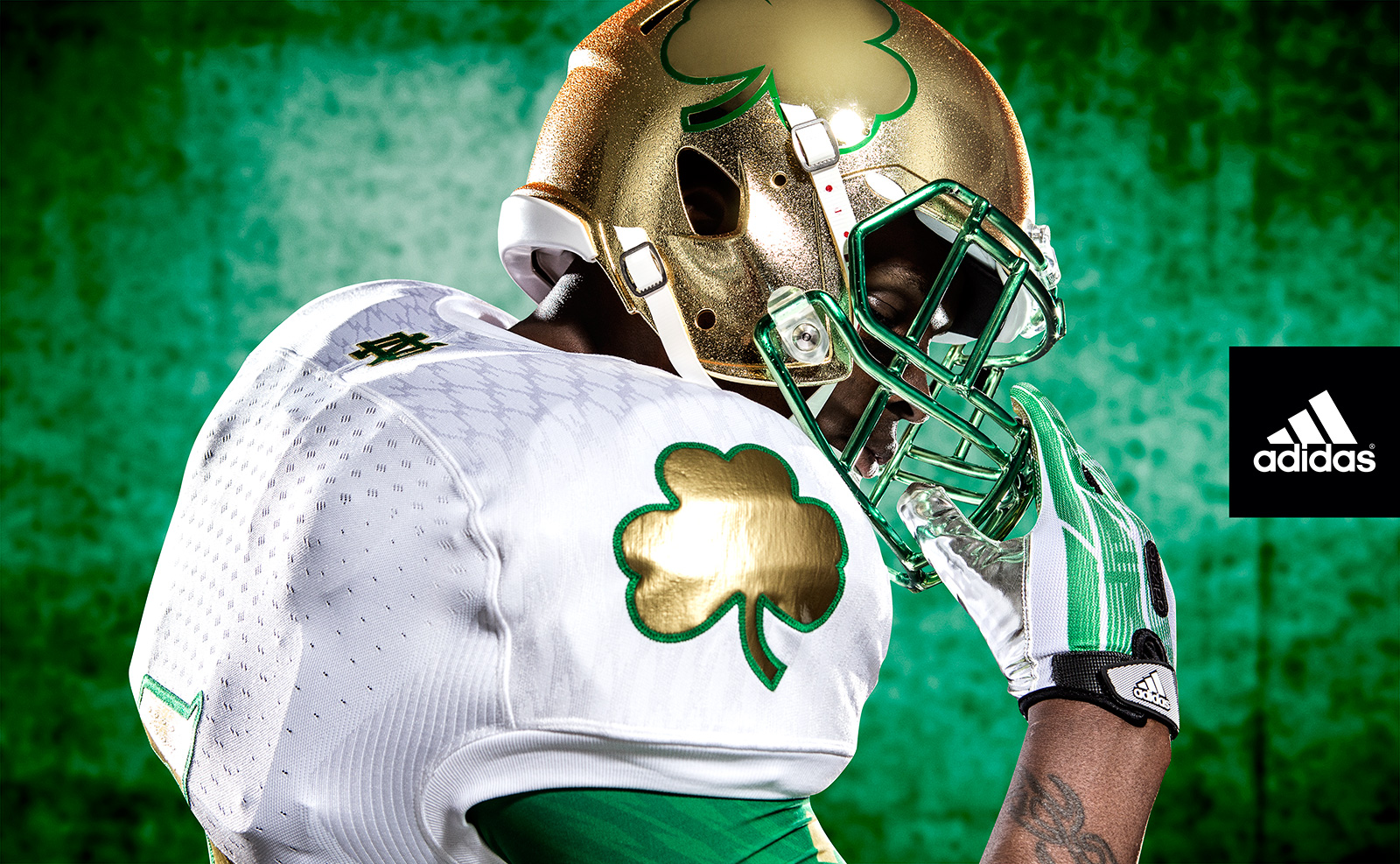
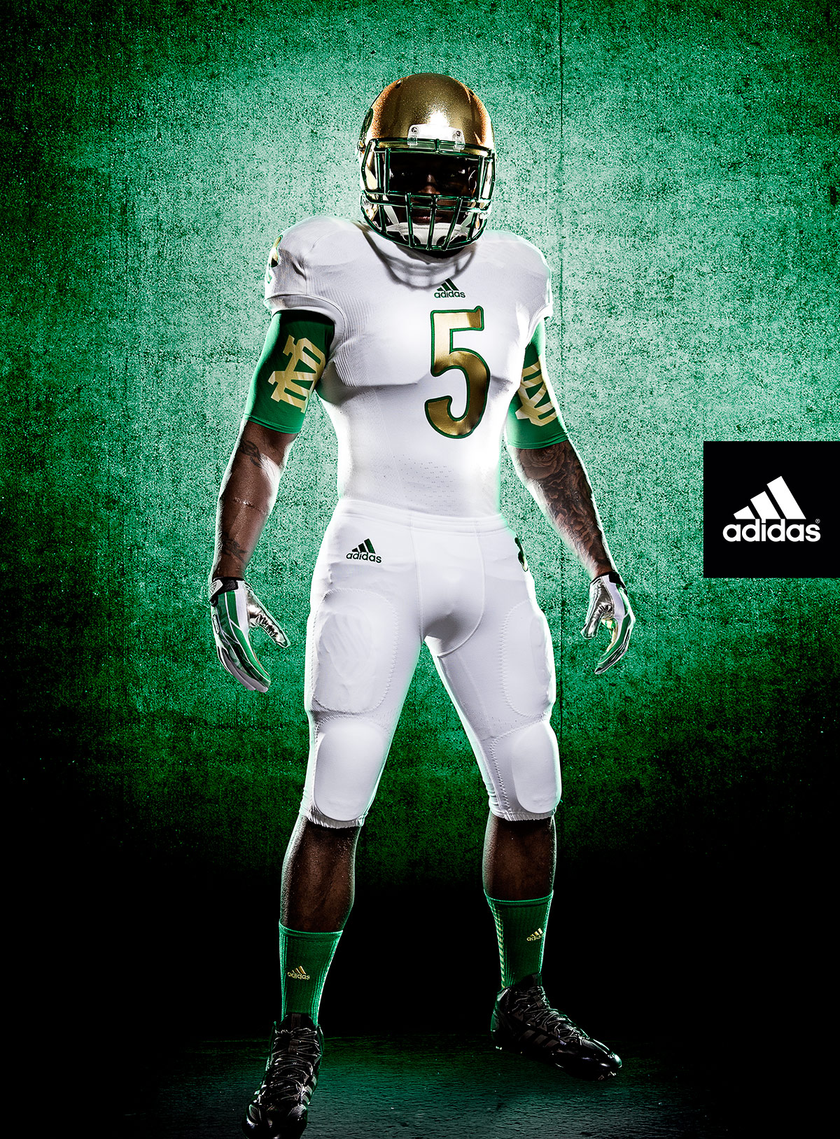
I love the all-white look. I’ve always been a big fan of green, so the use of it as one of the accent colors is a great touch. To top it off, the gold works perfectly to finish everything else off.
But the big thing, and the thing that usually drives us all insane when this uniform is revealed, is that Adidas didn’t mess with the helmet a whole lot. The only change is a simple decal of the same shamrock found on one of the shoulders of the jersey as well as the pants. The helmet also features a green facemask to match all the jersey accents as well.
Everything matches, it’s one cohesive design, and the helmet finally doesn’t look like an embarrassment. And if you think this makes the Irish look too much like Star Wars stormtroopers, keep in mind that they are playing in a stadium that is commonly referred to as the Death Star by the most popular sports radio station in the DFW area. So yeah, it matches that too (and, on a more serious note, the Cowboys also wear white as their home jersey as well).
It looks like it has taken a couple of years to figure this all out, but I definitely want to tip my hat to all involved on this design. This is great.
Shamrock Series Uniforms: Another Brian Kelly Lie.
Texan by birth, Irish by choice.
First-generation Domer and a former student manager, HLS podcast host, HLS Sim creator, Extra Life streamer, and technical problem haver. You can find more non-Notre Dame related writing on his Patreon.
- Epilogue - January 3, 2022
- HLS Podcast Finale - January 2, 2022
- The Final Fiesta: Notre Dame vs Oklahoma State NCAA ’14 Sim - December 31, 2021
Attention ND athletic dept: this works because it’s simple and classy. We’re not 100% resistant to change we just don’t like you absolutely f****ing every tradition we have. This is very nice and I can’t wait to see them.
Interesting thought, Tex about how this design might be a tribute to Los Vaqueros. If that was part of the plan, I like these even more.
That would be a guess (although I admit, the Death Star bit was my first thought) and it would make a lot of sense. ND is definitely getting better at this every year and I’m very much hoping tie-ins like Cowboys home whites are being thought of because that’s great for future designs.
It’s not quite a “simple decal.” The helmet shamrock is gold chrome (think of the chrome wings on Oregon’s helmets). The base helmet is the standard ND helmet, with a green chrome face mask. A nice gold-on-gold effect.
I used the term “simple” only in the sense that they really didn’t mess with the helmet much.
However, you are definitely correct in noticing the chrome aspects of the designs. I really wonder how it’ll look under the lights of Jerry World.
Jack: Please stop screwing with our helmets. Peace and love, your fellow alums.
Considering the first way they “screwed” with our helmets is giving us the awesome look we have now for all other games, I’d say they do have a decent idea of how to make things work.
Yes, the last two years we’ve seen bad helmets for the Shamrock Series, but slapping a decal on it (that actually matches the rest of the uniform) is fine in my book.
I mean, it looks a whole lot better than this true attempt change the helmets:.jpg)
Looks like a radioactive warning label
This years Shamrock unis and helmet look good, IMO. Actually, I liked last year’s uniforms, except for the garish helmets…